Media CSS
Images
Responsive Images
To make images resize responsively to page width, you can add the class responsive-img to your image tag.
<div class="col s12 center">
    <img src="../../img/responsive.jpg" alt="" class="responsive-img">
</div>
Circular images
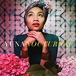
This is a square image. Add the "circle" class to it to make it appear circular.
To make images appear circular, simply add class="circle" to them
<div class="col s12 m8 offset-m2 l6 offset-l3">
    <div class="card-panel grey lighten-5 z-depth-1">
        <div class="row valign-wrapper">
        <div class="col s2">
            <img src="../../img/yuna.jpg" alt="" class="circle responsive-img"> <!-- notice the "circle" class -->
        </div>
        <div class="col s10">
            <span class="black-text">
            This is a square image. Add the "circle" class to it to make it appear circular.
            </span>
        </div>
        </div>
    </div>
</div>
Videos
Responsive Embeds
To make your embeds responsive, merely wrap them with a containing div which has the class video-container
<div class="col s12 l6 m8 offset-l3 offset-m2">
    <div class="video-container">
        <iframe src="//www.youtube.com/embed/Q8TXgCzxEnw?rel=0" frameborder="0" allowfullscreen></iframe>
    </div>
</div>
Responsive Videos
To make your HTML5 Videos responsive just add the class responsive-video to the video tag.
<div class="col s12 l6 m8 offset-l3 offset-m2">
    <video class="responsive-video" controls>
        <source src="../../video/movie.mp4" type="video/mp4">
    </video>
</div>